Friday 30 May 2014

Photo Friday - Understanding the Histogram for correct Exposure

Still working on 3 cushions, 4 quilts, lots of blocks... Not yet at a Friday Finish, so, how about a Photo Friday tip instead?

A lot of cameras, when viewing an image under playback or liveview, will have the option to show you a histogram.  All digital SLR (Single Lens Reflex) and mirrorless cameras aimed at enthusiasts will have this feature.  Point and shoot cameras may have it buried in the menus.


Unlike the old days of film, where you either trusted the camera's meter or bracketed (take 3 shots, 1 normal, 1 at more exposure, 1 at less exposure) and accepted what you got, with digital, we can get instant feedback and make adjustments straight away to take better photos in camera.  This is very handy when you are shooting something that can be difficult for the camera to meter.


Cameras are sophisticated pieces of equipment with different metering modes and algorithms that process what the camera sensor sees into what it thinks is the correct exposure for your image.  Subjects with a lot of white in them or subjects with a lot of dark can trick the meter into underexposing or overexposing respectively.  These would be common types of images to take in quilting!

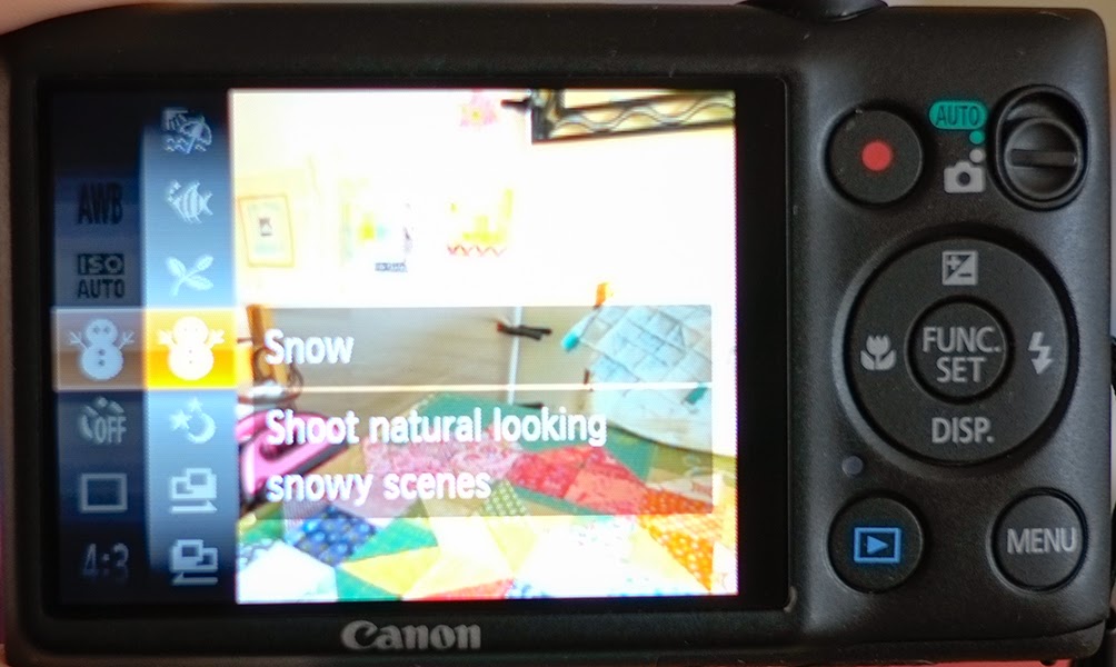
This is because the camera's default is to meter and give a reading for medium grey or 18% grey (a grey which reflects 18% of the light that falls on it).  So a photo of all white would be darkened and a photo of all black is lightened (try filling the frame and taking a photo of a black cat and see!)  If you have a compact camera you can help the camera out and chose a subject mode especially if taking photos of the kids in snow!

If you don't have a histogram available to you in camera you can view the histogram in photo processing software.  I've used Lightroom here but it's available in Photoshop Elements (F9 will open it) and also the free editor Pixlr will show you a histogram in the adjustment/levels command.


So how does a histogram work?  The  histogram takes information from the image captured by the sensor and gives you a graph of the tones from dark to light.  Areas of the image that read as black are represented on the left and areas that read as white on the right.  The information is available in the individual colours Red, Green and Blue as well as a combined RGB showing overall light to dark.

This image shows a spread of values from black to white with a little bit of clipping at the white end.  Just after the peak near the shutter speed of 1/210 sec you see the values start to rise again.  Try not to clip your whites as you will lose detail in these areas.  In this image, this tiny bit of clipping represents the bright sky peeking through the fence in the image above and I'm happy to let these blow out. (Sometimes, when taking a photo of a heavily saturated subject, you can get clipping in one of the colour channels.  If this happens you might want to deliberately underexpose to capture all the colour information!)

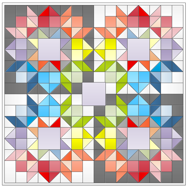
In this image below of a scrappy star there is a lot of white and you can see the histogram has no information showing at the white end.  This means that this is a little underexposed.


Adjusting the photo in Lightroom simply by clicking on Auto adds exposure and whites and gives a brighter image with a histogram spread out more evenly.


In this image  of a log cabin block you can see a lot of white but the image histogram has everything centered in the middle.


Adjusting gives a more right centered histogram with brighter whites and more detail in the dark blue.  This is a high key image with only a small dark area so I'm happy with this and don't feel the need to stretch the histogram further into the darks. 


Cameras that have the ability to shoot RAW format will give the most flexibility when processing your images.  RAW files are massive and contain all the raw data that the camera has captured.  Think of them as the negative of old and needs processing to get your finished image.  If you shoot JPEG you get smaller files but the camera has made the processing decision for you.


Did you know you can open your JPEG images in Adobe Camera RAW?  It doesn't give you the same flexibility as a RAW file but can help making adjustments easier when tweaking JPEG's.  The screenshots I've been showing you in this post are all from Lightroom.  Lightroom is built around Camera Raw.  If you have Photoshop or Photoshop Elements you can open your JPEG file in Camera Raw.  In elements go to Open As in the File menu and click on the drop down to Camera Raw.


Last Friday we looked at correcting colour using white balance adjustments.  This is the first step in the Camera Raw workflow and is another option to remove colour casts.  We've looked at understanding the histogram and in this post corrected underexposed images.  Next time we'll look at using Camera Raw to help with overexposed images.

I hope this info makes it easier for you to evaluate exposure in your photos.  There are a number of different ways to adjust you images but try Camera Raw if you can.  I'd be interested to hear how you get on with it!

Wednesday 28 May 2014

WIP - Playing with Colour


To celebrate Fluffy Sheep Quilting being 2 years open, Cindy very kindly gave a discount on her blog and I bought this fabric bundle of 9 fat quarters.  It's part of the blogger bundle collection on the shop and it was put together by Sarah at Fairy Face Designs. Isn't it really pretty?


As soon as I ripped open the blue packaging, I knew this was going to be used for the scrappy Swoon block I have planned for the Schnitzel & Boo mini-quilt swap. My swap partner loves rainbow, bright and modern fabrics so I needed to add a few more colours to this bundle of 9 to make the trip the whole way around the colour wheel.


I had great fun pulling everything from my shoe boxes of Fat Quarters and when they were all laid out together, I realised I didn't have enough variation  So, I broke up some precuts to add to it.  I added Charm pack squares from Domestic Bliss by Liz Scott.


Some dark blue and orange layer cake squares from Kate Spain's Sunnyside and even the small bit of Noteworthy (I am Noteworthy obsessed!) made it into the pile.


I'm not sure about the bright aqua or the orange at the moment and there are probably too many light blues but it's a colour wheel and it's pretty much complete, so I think I'm ready to just dive right in!


I also have a quilting plan for my 3 log cabin cushions.  I'm thinking of straight line quilting for the two smaller cushions.  I'd like to try matchstick quilting at some point and this small project seems ideal for this.  Another quilting pattern I've not tried yet is spiral, so I think the snail block is going to be my test piece for this one too!  It's really fun making a small project just to play and explore.  I'm not sure how many cushions one house needs but I'm sure I can squeeze in a few more! 

Linking up to
WIP Wednesday at Freshly Pieced
Sew Fresh Quilts

Monday 26 May 2014

Design Wall Monday: Log cabin exploration

I'm writing a blog post for the Modern Quilt Guild of Ireland page on the Log Cabin block and decided I needed more visuals so over the weekend I made a few different types of log cabin blocks.


A bento box made from 4 half log cabins or Chevron blocks and an off centre block.  I even made a traditional style block.  Just one all on its own!


And then a not so traditional!


This last one, the snail version, really caught my imagination and I couldn't help playing with it.


A table, perhaps?  Or a pair of spectacles or something else entirely?  Boo, maybe or an oh in surprise?
 
How about 4 blocks on point, turning in, or 4 turning out?  Yes I think I got carried away! 

There's a nice bento box tutorial on Film in the Fridge and Craftsy has a tutorial for the fussy cut block above in the Craftsy 2012 Block of the Month with Amy Gibson.  For my varying width snail trail I used 1.5" strips up to 5" and I hope to have it up as a free download this weekend coming.

I don't have a plan for the small log cabin block yet but the others are going to find their way into a few cushions for the sofa!  The snail block finished up at 19" square so I'm going to border it to bring it up to a 24" cushion. The Bento box and off centre block I'll border as well to bring up to 16"cushions. No ideahow I'm going to quilt them yet.  I am totally open to suggestions!

Linking up to Design wall Monday and
stitch by stitch

Friday 23 May 2014

Photo Friday - How to correct white balance for better colour.


Plum and JuneBeth at Plum & June organises a Let's Get Acquainted Blog hop for new bloggers and people with a blog less than 2 years old.  We have been visiting each others blogs and asking technical questions of each other to improve our blog posts.

One of the topics is photos (what size to use, how to take better pictures of our quilts and how to process those images later to make the most of them).  As all my projects are works in progress at the minute and I have no Friday finish to share,  I thought, this morning, I'd share a photo tip with you instead.

Ever come back from a holiday and all the photos taken outside look bluer than they should?  Or ever had to struggle to get photos of your purple quilt looking purple and not a blue or red tint to them?  A lot of problems with colour in images is down to White Balance.


You don't need a fancy camera to get good images.  You do need good light and light has a colour temperature.  Indoor light bulbs and candles give out a warm yellow/orange light.  Fluorescent tends to a green/blue and daylight is different again.  With all this variation, our eyes are amazing at adjusting to light and seeing white as white in all these situations.  Great and all as modern cameras are, they cannot make this distinction all the time.

One of the things that I do, to almost all my images of quilts and blocks, is check & correct the white balance.  Auto white balance will do a good job but there will be times when you need to override it to get the colours you want.  In this first example the difference is quite subtle.  There is an overall blue tint to the whites in this quilt top which as Kona Snow should be a little warmer.

Auto White Balance Outdoor overcast day
Corrected White Balance

This second example is probably a more common one where we take in progress shots indoors under tungsten light.  This light is very warm and it is very obvious here the camera's auto white balance has not been able to keep the whites white.
Auto White Balance Indoor Tungsten Light

Corrected white balance
Correcting the white balance makes a big difference.   Most cameras will have a white balance setting that can be adjusted and some of the more advanced cameras will allow you to set a custom white balance before you take the photo.  It is always best to correct in camera unless you are shooting RAW files. 

If you have already taken your images as JPEG and you can't go back and take them again because the block is already sewn in or the quilt has been given away, you can adjust your images in photo processing software.  I use Lightroom for 90% of my photo processing.  Lightroom was developed specifically for photographers and is designed around a workflow of adjustments from white balance and exposure through to colour & camera profiles.  The cheaper of the Adobe products but still chock full of functionality is Photoshop Elements and it's often included free when you buy your camera.


To adjust white balance in Elements, go to the Expert menu, click on Enhance/Adjust Colours/Remove colour cast.  A colour picker will appear with the message to click on an area that should be neutral in colour.  I clicked on the white area marked by the black dot in the screenshot below.


Much more pleasing colours!  You may have to hunt around and try a few places.  I would avoid using black or unless you are good at spotting a neutral or medium grey in your photo I would stick to white.  Too much correction will affect bit depth and reduce the quality of your image. 

If you don't have a photo processing software try using the free online program PicMonkey.  You will need to upload an image to edit and then go to Colours and use the neutral picker tool in the same way as Elements above.


PicMonkey is tons of fun and is worth playing around with.  Hope this how to post helps you get the colours you want in your images!

Wednesday 21 May 2014

WIP Wednesday - Moda Friendship blocks

At our Thursday night sewing group, some weeks ago, we decided to make a group project and chose to make blocks from Moda's Friendship Quilt-A-Long.  Moda released 31 blocks free to coincide with a blog hop showcasing the Moda designers.  All the blocks, except for this last one, have a light 3" centre where you can sign your name or showcase some favourite fabric.  This last block, number 31, is probably my favourite.  I love the colours that Paula chose for this hearts block.


As the blocks are only 9" finished we decided to make as many as we could between us.  Some of the blocks have quite a few pieces, approximately 2" and as you can see there is a bit of piecing in them.


I had block numbers 9 to 12 and then decided to do one more.  I used a mixture of Sunnyside by Kate Spain and Coquette by Chez Moi from layer cake 10" squares for my blocks.


Because there are so many small pieces, any inaccuracies in seam allowance builds up.  We ended up with 4 different sizes in the end between the 6 of us.  We all used different fabric ranges with a theme of Spring in mind and decided to sash the blocks to unify the whole quilt and help control the final size.


We auditioned a few fabrics but decided that Navy would work well with all the blocks.  So last weekend I cut 3" strips and chain pieced away.  Side pieces were 9.5" long and the top pieces were 14.5" long.


I kept the sashing on the large side so we have options in the layout.  Tomorrow night, we can have fun laying them out.  I love this bit, arranging, re-arraning and swapping around!  We could do a straight layout or an offset one and trim the borders back. 


This is my first group quilt and it has been tons of fun.  The blocks themselves need reading through first as I don't think there is any one of us that didn't have a problem at some stage.

If you want to try any of these Sylvia's Stitches has collated them all on her blog along with links to the designers they were allocated to.  Some of the designer links don't work anymore but the block links all work perfectly fine.  They are all sitting in a pile at home now and I can't wait to bring them to the group for the next stage of putting them all together!

Linking up to
WIP Wednesday at Freshly Pieced
Sew Fresh Quilts

Monday 19 May 2014

Virtual Design Wall Monday - Scrappy Swoon

One of the swaps I took part in last year and enjoyed immensely was organised by Schnitzel & Boo.  Over 200 of us took part in making mini-quilts 6" square to 24" square maximum.  I made this applique mini quilt for my partner in Washington, USA and I received this quilt from New Jersey from Christina.
This year 600 people signed up!  I got my partners information over the weekend and as it is a secret swap I can't follow her officially but I have been having a look at her website and favourites on Flickr trying to figure out what to make for her.  Yes I've been stalking!  Only occasion I can think of when this is actually a good thing!

My swap partner loves Thimble blossoms, bright colours, Rainbow quilts and Heather Ross.  Now I have no Heather Ross prints in my stash (I know, I should probably go shopping!) but I do have a book and pattern or two by Camille Roskelly of Thimble blossoms fame.  I love bright rainbow colours so have a bit of that on hand and that got me thinking.  How about a Rainbow Scrappy Swoon?


I couldn't help myself, I had to play with background colours.  I really like the black background on this but I think my swap partner would like the white. There's even a nice square in the middle for a fussy cut something (this could be good place for a Heather Ross print if I can find one!)

The Swoon block is 24.5" and I think I could be forgiven a 0.5" over on size.  More than likely shrink on quilting too as I think this could be a great candidate for trying out matchstick quilting!


Of course I didn't stop there on my virtual design wall.  How about 4 mini swoons with space for 5 fussy cut prints?   I could definitely see this in a 60" quilt to brighten up the living room.  Is this one a bit too much for a mini?

Linking up to Design wall Monday and
stitch by stitch
Related Posts Plugin for WordPress, Blogger...